Adding Boxes in the WebCMS Editor
Boxes are used to highlight specific web content. Each box style has specific content requirements and should be used appropriately.
On this page:
Add Boxes
This example applies to building a box below the body section and in the sidebar.
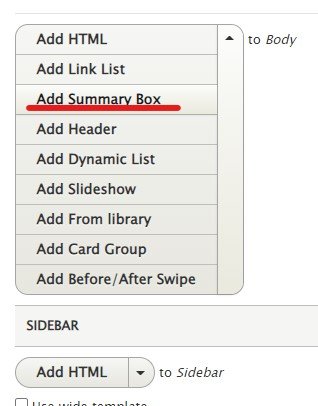
A list appears when clicking on the "Add HTML" down arrow.


Select "Add Box" to open the box dialogue window.
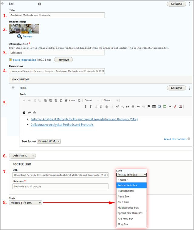
- Add the title
- The Header image, while optional, should be sized around 640x200 pixels. A header image in a Summary Box (default) will be aligned left.
- Alternative text is required if you choose to add a Header Image
- To add a Header Link, start typing in the title of the page you want to link to, then select the page from the dropdown
- Add content in the Body section
- You can add more types of content. You will need to click this button at least once!
- You can choose to add a link below the content in the box. When saved, the link will appear right aligned in the box type background color, if the box type has a color. If you add link to a Summary Box (default), it will appear as a Call-to-Action button.
- In the Style dropdown, select which type of box you want to use
Save the page. The box appears below the main body content. To make further edits to the box, if you've added it using the WYSIWYG Paragraphs button, right click on the box and select Edit Paragraphs.
Summary Box
Identified by no title/header and blue background.
This is the default box available in the WebCMS Editor toolbar's paragraph icon. A summary box cannot be floated left or right.
This box type does not contain critical or featured content. Use this box to summarize dense content or highlight a short, actionable list.
Related Information Box
Identified by a green header and border.
Also known as the multipurpose box. This box type does not contain critical or featured content.
When used, it can be floated left or right. These boxes contain Related Information / More Information / Related Topics content (but will not necessarily have any of these phrases in the title).
Alert Box
Identified by a red header and border.
The alert box is reserved for very important messages.
- Not just for emergencies, but can also be used for high priority, short deadline announcements such as new software releases for site users, notices for review, or expiring comment periods.
- To comply with Section 508 requirements, text headings for all alert boxes should also indicate the alert status, i.e. “Emergency Alert: Pesticide Safety Notice”.
- In general, this should not be considered a permanent element on a page. An exception would be things like the number to call for chemical spills.
Alert box title examples:
- Less accessible: Hurricanes expected!
- More accessible: Emergency alert: Hurricanes expected!
- Less accessible: Air Quality Info
- More accessible: Air Quality Alert
How to:
Highlight Box
Identified by a bright orange header and border to attract attention.
The Highlight Box is used to contain:
- one set of related, critical, featured content
- a new regulation or publication
- data and statistics
- fast facts and top tasks
- questions - Did you know? or How do I?
How to:
Special One Item Box
Identified by a light gray box in the background, with no border.
This box is used to feature one special item, such as one link to one page (unlike the Highlight Box, which can have a related set of featured content items).
How to:
MultiPurpose Box
(Note! This section is using the USWDS Grid to control the box layout. Three boxes, side by side! Pretty cool.)
There are three types of multipurpose boxes that you can build:
Multipurpose Box with a Header Title
Identified by a gray border and dark gray header background.
This is for all content that needs to be boxed and does not meet other box styles content requirements.
You can add as much text, lists, lists items and images as you need.
How to:
Multipurpose Box with a Header Image
Identified by a gray border and an image that extends to the width of the box.
The multipurpose box with an image header is the same as a multipurpose box, except an image is expected to be at the top of the box.
The header image size is 320 x 200 pixels.
How to:
News Box
Identified by a dark blue header and border.
This box is for a list of events, such as recent press releases or upcoming calendar events.
How to:
Feed Box
Identified by a royal blue header and border, with a heavy bottom border.
- Used to display news release entries
- Add a link to EPA newsroom
You can use JavaScript to pull in 3rd-party content, but you will be responsible for that content. Dynamic lists can pull in www.epa.gov content without JavaScript.
How to:
- Feed box in Pattern Lab
- If you use JavaScript, it's important to add fallback content, which can be displayed if JavaScript is disabled on the reader's computer. Webmasters must add code and JavaScript. See: Javascript: RSS Feed.
- If you use a dynamic list, it will work without the need for fallback content.
Perspectives Box
Identified by a light green header and border, with a heavy bottom border.
- Used primarily on microsite homepages.
- Displays links to perspective content.
How to:
- Perspective box in Pattern Lab
- Manually add blog title links, authors, and teaser information to the body field or use a dynamic list to pull out Perspective content
- If you manually add links, you'll have to continuously update this content.
- You can add a link to the footer for readers to read more of the same content.


