Creating Cards How To
About the card component
Cards contain content and a call to action about a single subject.
A card is often a subset or summary of a larger idea. It acts as an entry point to more detailed information. Each card must contain a heading, a short introductory sentence or two (no more than 25 words) and a call to action (linked button).
An individual card is typically a member of a collection of similar cards, and does not exist as a single card in isolation.
Finally, a card is modular. This means that you can vary the order of cards in a collection without destroying any individual card’s meaning.
Training Video
How to Create Cards training video
Guidance
Use the card component when you need to present a collection of related groups of content, like sections of a website. Refer to U.S. Web Design System (USWDS) for more information on usability, accessibility, and when to consider something else (other than cards).
How to add a card
Note: As of July 2022, adding multiple links to a Card is no longer an option. The video will be updated.
Cards can be added in the Edit view of a webpage (in the body of the page) or in Layout Builder view.
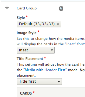
Click Add HTML (drop down) > Add Card Group

The card group fields open.
For each card group:

- Set the layout
- Three cards in each row - "33/33/33" or two cards in each row - "Flag = 50/50"
- Select whether the title or the image should be first
- This option is only available in the default 33/33/33 layout
- Select whether the cards are inset (padding between the card contents and the card border) or exdent (no padding)
For each individual card:
- Select the flag image aligment
- If your card group is Flag, you can chose whether the image should be left or right-aligned
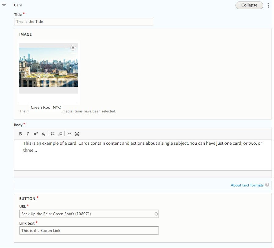
- Add a Title
- Add an Image (optional)
- Add Body text
- Note: you will not be able to add links to the card body
- And add a Button with a URL and linked text
- Note: you will only get one button
- Follow the Link Text and Writing for the Web standards

Note: The aspect ratio of the image should be about 5:3 (width:height). If you create an image with the right aspect ratio and use the focal point, your card images will look good across all devices and window sizes.
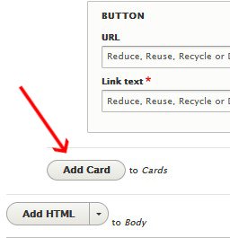
To add another card, click Add Card.

The page must be saved for the card to be saved.
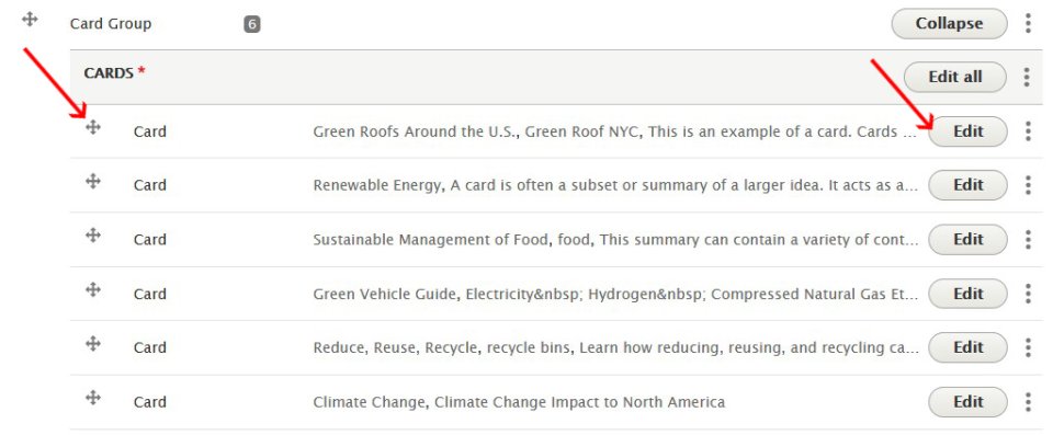
Once saved, you can go back in to re-order your cards by clicking the arrows and dragging to the order you desire, or click Edit to edit that individual card.

Click Save to save your page and see your cards.
Insert the Header Paragraph type to separate rows of cards. You can add header text using the "Add Header" or "Add HTML" drop down menu.
Card Styles
Cards can be created with and without images. Cards are a paragraph type, and they will appear at the bottom of your page. View card styles below.
-
This is the Title

This is an example of a card.
-
This is the Title

A card acts as an entry point to more detailed information.
-
This is the Title

This is a short sentence to inform the reader about where the button below will take them.
What Not to Do
The last three are examples of how cards should not be used. Remember: just because you can doesn't mean you should!
-
This is the Title
When you use the traditional card layout, you must have three cards across. An image is not required. A short sentence (or two) must be added to the body of the card (that's what this is!).
You can't add links and text styling is very limited in the body field of the card.
You can add bullets though:
- They look a little strange when there are a lot of them.
- Users may not be sure where they will go when they click on the button below.
- You can only have one link (call to action) per card, so why would you confuse people with bulleted lists?
- And even more text makes this card very tall, perhaps taller than the other cards.
- Which also looks weird.
-
You must have a complete set of cards!
.
Flag Cards
Flag cards anchor the image to the left or right of the text.
-
Left Flag Card

This is the first card in the flag card group. It defaults to the left. When you use the flag layout you must have two cards across.
-
Right Flag card

This is the 2nd card in the flag card group. It floats to the right.
