Buttons
A button calls attention to important actions with a large selectable surface (hence the name, CTA = Call to Action).
On this Page:
- How to Use the Button Component
- When Not to Use the Button Component
- Styling a Link as a Button
- Other Button Styles
- Contrast Colors: Best Practices for Accessibility
How to Use the Button Component
Important actions. Use buttons for the most important actions you want users to take action, such as "Register", "Sign up" or "Join the meeting".
Use buttons sparingly. More than two buttons looks cluttered and confuses users. Use buttons only for calls to actions.
Keep button text short. Button text should be as short as possible with action words that clearly explain what will happen when the button is selected.
Lead with a verb. Make the first word of the button’s text a verb.
When Not to Use the Button Component
Linking between a site’s pages. Use regular links instead. Don't use buttons in place of links.
Less important actions. Less popular, more destructive (like "delete"), or less important actions may be visually styled as links.
Styling a Link as a Button
- Add your text like "Join the Teams Meeting” or “Register Now!” (Remember these are calls to action)
- Add a link to the text
- In the source code, locate the link and to it add class="usa-button"
Your text will now appear as a button and your link will be embedded with the button.
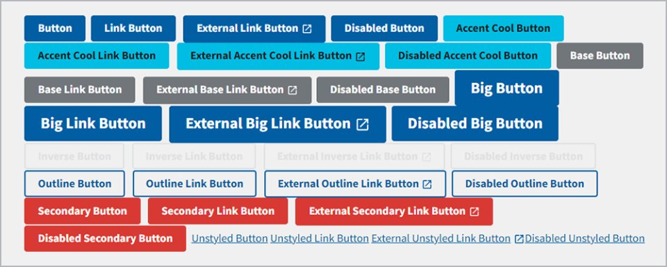
Other Button Styles
The WebCMS uses the default button styling provided by the U.S. Web Design System. All button styles are available in Pattern Lab. Add the style by modifying the style name in the source code. For example, to use the Accent Cool Button, the class in the a tag would be:
class="usa-button usa-button--accent-cool"Refer to the Pattern Lab for additional button colors and styles.
Contrast Colors: Best Practices for Accessibility
When building buttons or a link as text, check the contrast between the text and its background. For a dark background, choose a light text color. For a light background, choose a dark text color.
Example of button contrasts on a dark background:

Example of button contrasts on a light background: